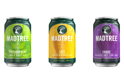
I have been throwing you guys as many hints as possible on social media – especially when their sweet new distro van was parked outside of 1.0 a week or two ago – but now the cat’s out of the bag and I can let loose on this one:
MadTree is re-branding… or refocusing their brand is a better way to put it. MadTree’s marketing director Emily Chapel had some things to say about the old design in their official press release this morning:
“The legacy can designs were unconventional and stopped consumers with their bold, bright designs when first launched, but the messaging and facing standards became confusing as the market has grown and become more crowded. The cans weren’t telling the whole MadTree story.”
While there is a lot of marketing mumbo-jumbo here about facing standards and what-not, if you really want to understand the why behind MadTree’s change here – it hits two parts. The first is simple – craft beer has changed a lot in the time since MadTree was the first to launch craft beer in cans in Ohio. Take a good, hard look at a shelf in your favorite bottle shop.
While when you, as a MadTree fan, stand looking at a beer shelf might recognize MadTree over their competitors… the cans themselves no longer stand out. Cans are all over, from breweries big and small… and MadTree gets lost if you aren’t already familiar with their brand.
This is no bueno… and I would think a massive part of why they decided to rework the look of their designs… but it’s not all.
Inspiring Madness, Rooted in purpose.

If you are a listener of Cincy Brewcast, and you listened to Volume 4, Episode 26 back in October – you heard Brady and Kenny talk a lot about refocusing their focus. This is the bigger reason that you’re seeing the changes happen when, and how they are.
The cans themselves are finally getting the Independent Craft Brewer Seal, and some uniform design elements… but refocusing their focus isn’t just about a shiny new rebrand of something. The MadTree team has spent countless hours trying to make sure that they understand the little pieces of what makes them who they are. Being rooted in purpose while living in a constant world of change and innovation isn’t as easy as you think it might be at first glance, and don’t think that they take it lightly, either.
You’ll see this new branding work its way into a lot of new things with the brewery – and I don’t doubt that you’re going to see a reinvigorated excitement from the brewery for 2019 as well. New branding will always shake up a business, but making sure that people are aware of the new branding and getting the word out is key.
It’s easy to get lost in not just an increasingly crowded Cincinnati beer community, but in a bigger Craft Beer community nationwide as well. MadTree stands out in who they are as a company, and they want to make sure that they stand out in how they showcase that to their fans, also.
The Rest Of The News

In addition to the new look that their cans are getting, their logo is getting a slight redesign too to match it all. They’re featuring a new green color in all their designs that they’re calling “Spruce” – a new subtle way to tie it all together. Even more exciting than subtle label sprucing up, though – 12packs.
Drinkers have been waiting for this one! The brewery made the announcement today that Psychopathy and Lift would be making their way into 12oz Twelve Packs too alongside their new branding designs.
Yes – it’s a good day to be a MadTree drinker!
